This post consists of a few timeseries examples from my upcoming book on statistical and machine learning using Python, also to be published by Apress,as my co-authored book Python for SAS User
Shifting Time series
Shifting timeseries is needed when we process data across time. For example, when we compute daily percent change, we are comparing each time point with the one from the day before, diff(1)/shift(1). On the other hand, when comparing with something from tomorrow, we would need diff(-1)/shift(-1), where -1 means to go forward into the future. Oh well.
In working with data with strong seasonality, we may use year over year. In the case of quarterly data, a common metric for measuring rate of change without seasonality is diff(4)/shift(4).
There are two main shifting methods in pandas: shift() and tshift(). The difference between them is that shift() shifts the data whereas tshift() shift the index. Both can take positive or negative integers to specify number of shifting periods, where positive integer results in lagging and negative number results in leading.
Under the hood, tshift() is reindexing the time index. If you get an error, you should check whether there are duplicates in the datetime index or whether your datetime index has a frequency.
We now use S&P 500 data to show a few more examples.
Example: S&P 500 Historical Prices and Returns
S&P 500
The S&P 500 Index is a market-value-weighted index of the 500 largest U.S. publicly traded companies. The index is widely regarded as the best gauge of large-cap U.S. equities.
Mutual funds and ETFs that track S&P Index are part of most passive investors’ portfolio.
The snippet below shows steps to import, and find the dates with the extreme values, and perform index slicing on the dates and type of data. We use the pandas_datareader library (version 0.8.1) to get historical S&P 500 stock index data from Yahoo Finance. Other libraries such as quandl will work just as well.
The function pdr.get_data_yahoo takes three inputs: symbol, start date and end date, with the default end as today’s date. df.idxmax(axis=0, skipna=True) returns the dates with the highest value in every column, which shows that the highest S&P 500 took place on February 19, 2020, although the highest trading volume occurred on October 10, 2008 during the last Financial crisis.
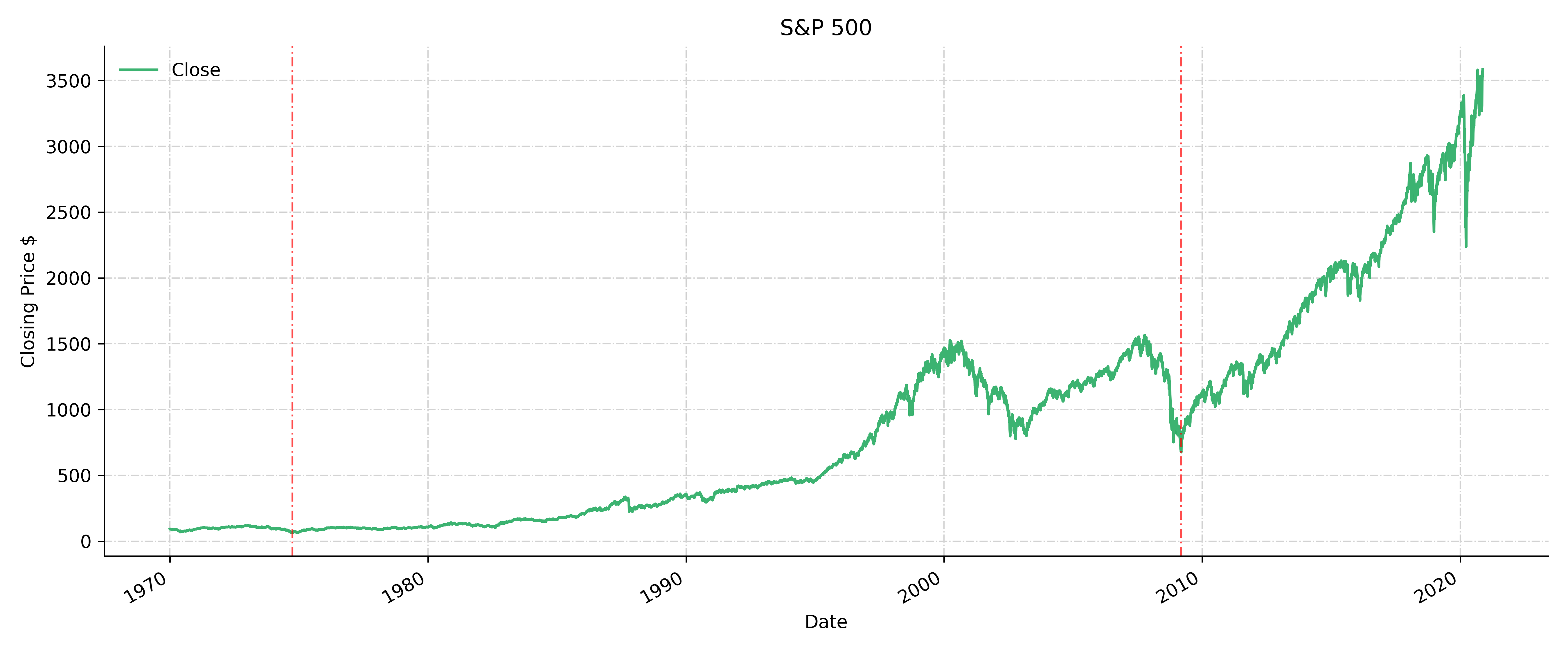
On the other hand, the historical lowest occurred in 1974 . The 1973–74 stock market crash caused a bear market between January 1973 and December 1974, which was one of the worst stock market downturns since the Great Depression. The partial indexing df.loc[“2000”:,’Close’].idxmin() tells us the lowest price since year 2000 happened on September 9, 2009 during the last Financial Crisis. The timestamp of the lowest historical since 1970, and the timestamp of the lowest value in the Financial Crisis are used in the ax.axvline to plot the vertical dashed lines.
 pd.options.display.float_format = '{:10,.1f}'.format
 import matplotlib.pyplot as plt
 import datetime
 start = datetime.datetime(1970, 1, 1)
 end=datetime.date.today() # today is 04-18-2020
 import pandas_datareader.data as pdr
 df = pdr.get_data_yahoo('^GSPC', start=start, end=end)
 df.tail()
[Out]:
                 High        Low       Open      Close    Volume  Adj Close
Date
1970-01-02       93.5       91.8       92.1       93.0   8050000       93.0
1970-01-05       94.2       92.5       93.0       93.5  11490000       93.5
1970-01-06       93.8       92.1       93.5       92.8  11460000       92.8
1970-01-07       93.4       91.9       92.8       92.6  10010000       92.6
1970-01-08       93.5       92.0       92.6       92.7  10670000       92.7

 df.idxmax(axis=0, skipna=True)
[Out]:
High        2020-02-19
Low         2020-02-19
Open        2020-02-20
Close       2020-02-19
Volume      2008-10-10
Adj Close   2020-02-19
dtype: datetime64[ns]

 df.idxmin(axis=0, skipna=True)
[Out]:
High        1974-10-04
Low         1974-10-04
Open        1974-10-04
Close       1974-10-03
Volume      1970-05-11
Adj Close   1974-10-03
dtype: datetime64[ns]
Let’s plot the data and highlight those dates with the lowest prices.
price_min = df.Close.idxmin()
financial_crisis =df.loc["2000":,'Close'].idxmin(axis=0, skipna=True)
plt.style.use('default')
fig, ax = plt.subplots(1,1, figsize=(12,5))
ax.spines['top'].set_visible(False)
ax.spines['right'].set_visible(False)
df.Close.plot( color='mediumseagreen', ax=ax)
ax.axvline(price_min, color ='red', alpha=0.7, dashes=(5, 2, 1, 2), linewidth=1.0)
ax.axvline(financial_crisis, color ='red', alpha=0.7, dashes=(5, 2, 1, 2), linewidth=1.0)
plt.legend(loc='upper left', frameon=False)
plt.ylabel("Closing Price $")
plt.grid(color='lightgrey', linestyle='-.', linewidth=0.7)
plt.tight_layout()
Daily returns
Now we look at daily returns. df.Close.diff(1)/df.Close.shift(1) is how we would compute daily return. The convenient pct_change function gives the same results.
# daily return
 rets = df.Close.pct_change()
 rets_manual = df.Close.diff(1)/df.Close.shift(1)
np.testing.assert_allclose(rets_manual,rets,rtol=1e-5)
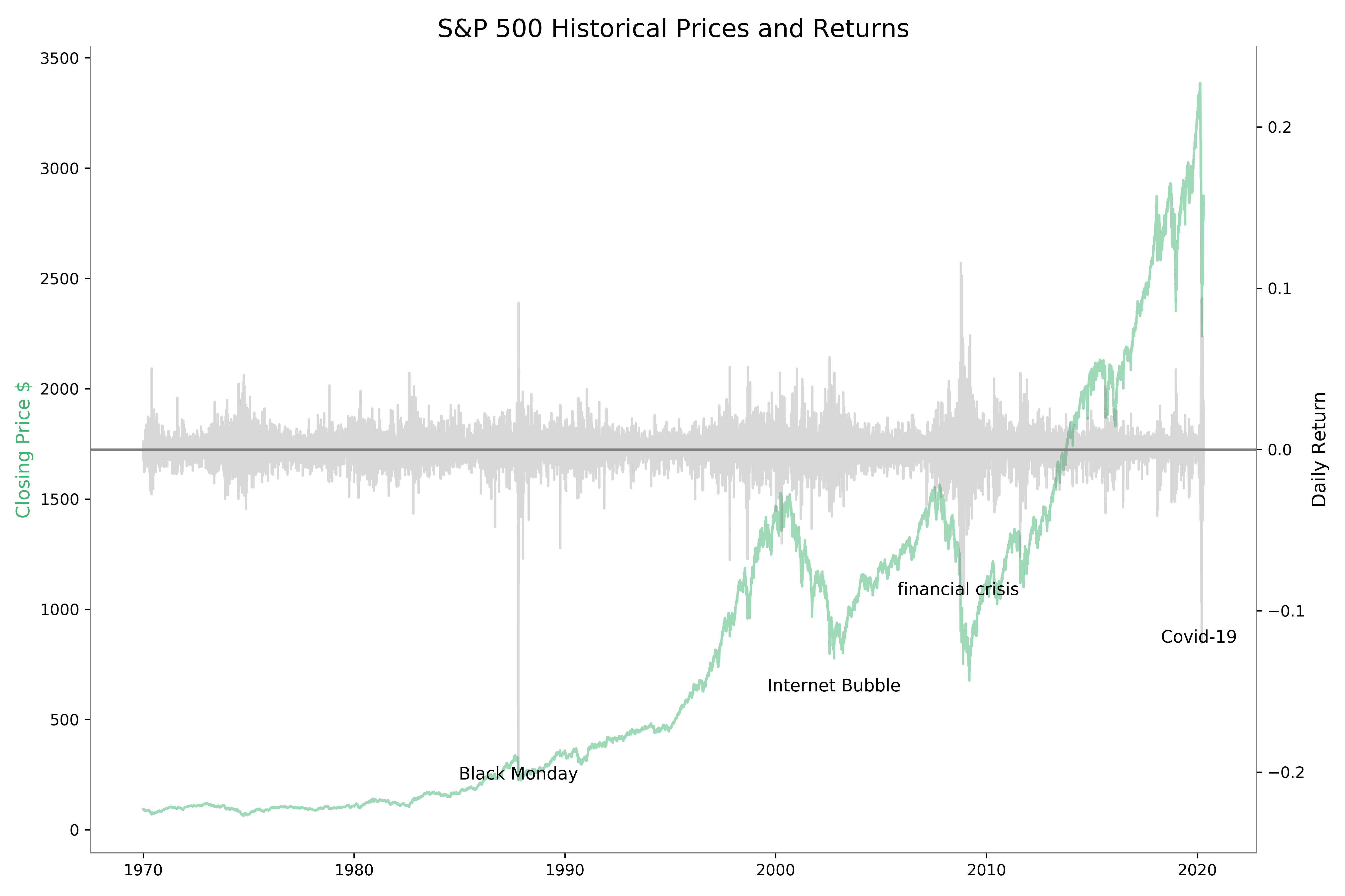
Then we use the nsmallest() function to get those dates when the largest price decline happened. The date with the lowest daily return was 1987-10-19, which was the Black Monday, one of the worst stock crashes in history. The two that followed was on March 16 and 12, 2020, due to the Covid-19 pandemic lockdown. The fourth was the 2008-10-15 of the Financial Crisis.
The nlargest() function give those dates when the largest price jump happened. The biggest jumps happened right before or after to the largest drop. It seems that investors changed their minds overnight.
Anyhow, those are the times with great economic uncertainty and volatility.
nsmallest = rets.nsmallest(4)
print(nsmallest)
Out:
Date
1987-10-19   -0.205
2020-03-16   -0.120
2020-03-12   -0.095
2008-10-15   -0.090
Name: Close, dtype: float64

 nlargest = rets.nlargest(5)
 print(nlargest)
Out:
Date
2008-10-13   0.116
2008-10-28   0.108
2020-03-24   0.094
2020-03-13   0.093
1987-10-21   0.091
Name: Close, dtype: float64
We plot historical prices and with the worst days in S&P history annotated.
# ploting
style = dict(size=11, color='k')
plt.style.use('default')
title = "S&P 500 Historical Prices and Returns"
fig, ax1 = plt.subplots(1,1, figsize=(12,8))
ax2 = ax1.twinx()
ax1.spines['top'].set_visible(False)
ax1.plot(df.index, df.Close,color='mediumseagreen',alpha=0.5 )
ax2.plot(rets.index, rets,color='grey',alpha=0.3)
ax2.axhline(0, color='grey')
ax2.text(nsmallest.index[1],nsmallest[1], "Covid-19 ", ha='center', **style)
ax2.text(nsmallest.index[3], nsmallest[3], "financial crisis ", ha='center', **style)
ax2.text(Black_Monday, rets.loc[Black_Monday], "Black Monday", ha='center', **style)
ax2.text(Internet_Bubble, -0.15, "Internet Bubble", ha='center', **style)
plt.title(title,fontsize=16)
ax1.spines['bottom'].set_color('grey')
ax1.spines['left'].set_color('grey')
ax1.spines['right'].set_color('grey')
ax2.spines['right'].set_color('grey')
ax2.spines['bottom'].set_color('grey')
ax2.spines['left'].set_color('grey')
ax1.set_ylabel("Closing Price $",color='mediumseagreen',fontsize=12)
ax2.set_ylabel('Daily Return', color='k',fontsize=12)
ax2.set_ylim(-0.25,0.25)
Monthly returns
To get monthly return, our first instinct might have been using freq=’M’. But since the data only occurs on business days, then we need to use the prefix B for the frequency. Otherwise the result can be incorrect.
#monthly return
 df.Close.pct_change(freq='BM').dropna().tail(2)
Out:
Date
2020-09-30   -0.039
2020-10-30   -0.028
Name: Close, dtype: float64

 oct = df.loc['2020-10-30','Close']
 sep = df.loc['2020-09-30','Close']
 aug = df.loc['2020-08-31','Close']
 (oct-sep)/sep
Out: -0.02766578622137972
 (sep-aug)/aug
Out: -0.03922797017842309
Annual returns
Annual return or percent change year over year is commonly used in all industries. The easiest is to use pct_change(freq=’Y’) or pct_change(freq=’BY’) function. You need to be careful to use the correct frequency otherwise the results will likely be incorrect.
In example below, we compute and plot annual returns of S&P 500 since 1970. Because pct_change(freq=’BY’) is only for full years, it will not work for the latest year to date. Although there are other ways of handling it, here we will use the year to date as if we had a full year. Thus, the annual return for 2020 is return_2020 = adj_close[-1]/adj_close.loc[‘2020-01-02’]-1.
 adj_close = pdr.get_data_yahoo('^GSPC', start=start, end=date.today())['Adj Close']
 title = "Annual Returns"
 Annual_return = adj_close.pct_change(freq='BY').dropna().asfreq('BY')
 return_2020 = adj_close[-1]/adj_close.loc['2020-01-02']-1
# pretend we had a full year already in 2020
 idx = pd.date_range(date(2020,1,1),date(2020,12,31), freq='BA-DEC' )
 Annual_return = Annual_return.append(pd.Series(return_2020,index=idx))
# plot
 fig, ax = plt.subplots(1,1, figsize=(12,5))
 ax.spines['top'].set_visible(False)
 ax.spines['right'].set_visible(False)
 ax = plt.bar(Annual_return.index.year, Annual_return,alpha=0.5)
 plt.axhline(Annual_return.mean(), color='r', linestyle='--')
Figure shows the annual return from 1970 to 2020. The horizontal dashed line is the average of annual returns.
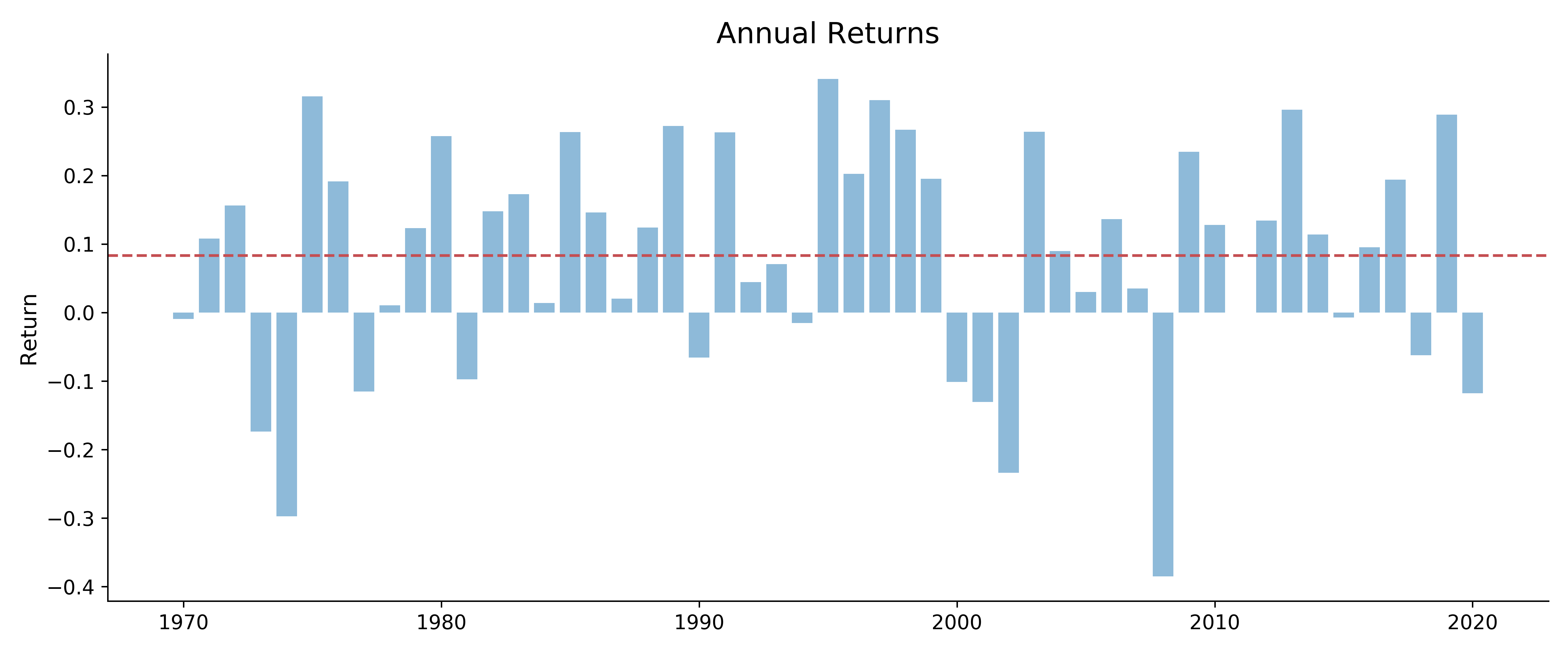
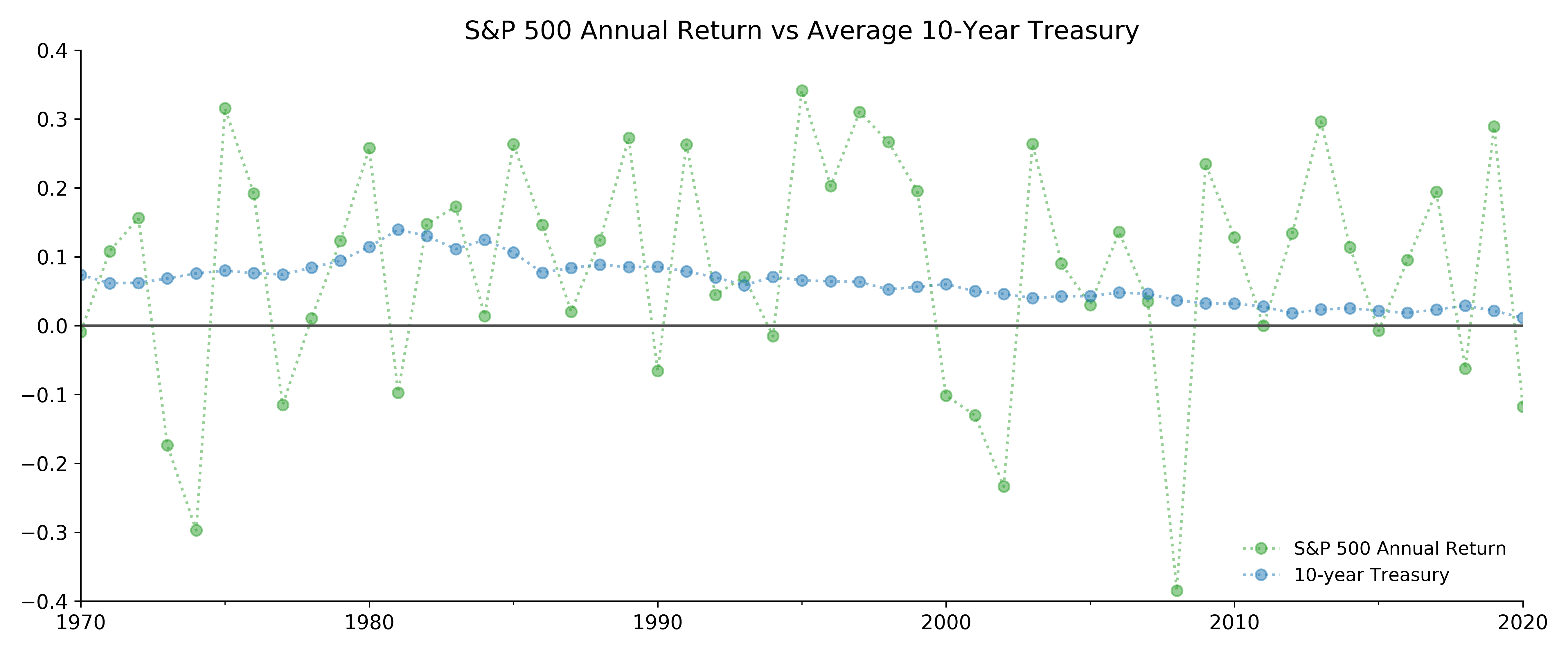
Before 1984, investing in the S&P 500 stock market seem hardly worth it: roller-coaster-like returns with -29.7% in 1974 and 31.1% in 1975 while the safe 10-year Treasury was averaging between 6% and 12.5%.
In 1982, the return from S&P500 was 14.8% when average 10-year Treasury yield was 13.0%.
In quite several years the S&P 500 annual return was terribly negative when one could have gotten safe returns from the government bond.
But after the Financial Crisis in 2009, the stock market annual returns have stayed positive except 2018 and 2020.
History shows us that even investing in the S&P 500 does not always yield great returns. If we invested on 2000-03-24, the best day of S&P stock prices before 2001, and hold it for twenty years until 2020-02-19, its peak before the market crash prior to the Financial Crisis, our annual rate of return would have been a not-so-amazing 4%. When computing returns over a period, we usually use adjusted closing price instead of closing price. We will compute annualized return and continuous annual return.
In the next example we compute annualized return and continuous annual return. History shows us that investing in the S&P 500 does not always yield great returns. If we invested on 2000-03-24, the best day of S&P stock prices before 2001, and held it for about twenty years until the all-time high on 2020-11-14, the annual rate of return would have been a not-so-amazing 4%.
If you are curious enough to check what was the S&P on 2020-03-24, the twenty-year anniversary, you will find a disappointing 2447, yielding 2.4% annual return.
Timing is so important.
When computing returns over a period, adjusted closing price is used. For those who are following, the peak before the Covid pandemic was 3386.150 on Feb 19, 2020. The index went to 3585, about 200 points higher than the peak before the pandemic.
 df = pdr.get_data_yahoo('^GSPC', start=datetime(1970,1,1), end=datetime(2020,11,14)['Adj Close']
 df.nlargest(2)
Out:
Date
2020-11-13   3585.150
2020-09-02   3580.840
Name: Adj Close, dtype: float64
 df[:'2001'].nlargest(1)
Out:
Date
2000-03-24   1527.460
 n = df.idxmax().year-df[:'2001'].idxmax().year #20 years
 Annual_return = (df.max()/df[:'2001'].max())**(1/n)-1
 print("{0:.2%}".format(Annual_return))
Out: 4.36%

 continuous_return = np.log(df.max()/df[:'2001'].max())/n
 print("{0:.2%}".format(continuous_return))
Out: 4.27%
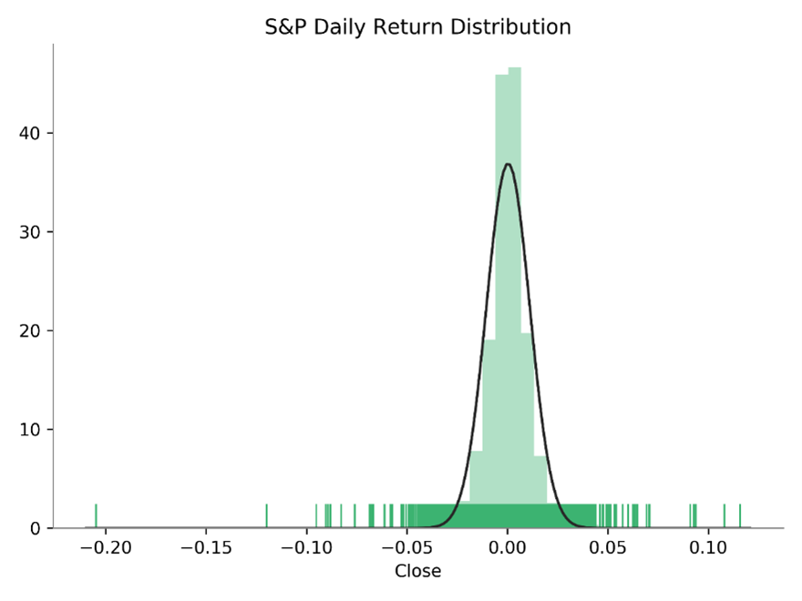
We run a statistical test to see whether returns are normal. The test result shows that return is far from being normal. Alternative tests (not shown) will come to the same conclusion.
 from scipy.stats import norm
 norm_test =stats.anderson(rets.dropna(), dist='norm')
 stat, p = stats.kstest(rets.dropna(), 'norm')
 print('p-value: {0: .4f}'.format(p))
Out: 0.0000
 sns.distplot(x, fit=norm, kde=False, rug=True)
