Often we need to plot a few things in subplots for comparison. An simple example of subplots.
Rows and Columns
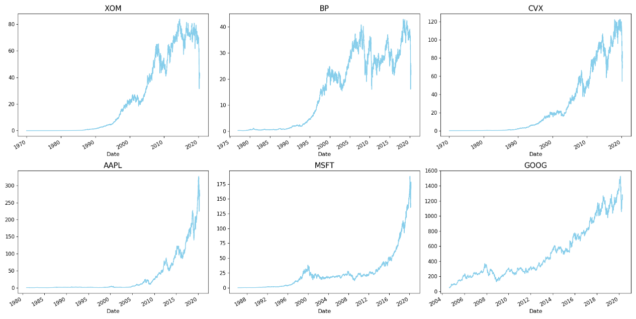
Let’s automate the number of rows and column once and for all. The key is to use quotient i//width and remainder i%width.
import matplotlib.pyplot as plt
tickers = [
    'AAPL', 'ADBE', 'AMD',  # Apple, Adobe, AMD
    'AMZN', 'CSCO', 'EBAY', # Amazon, Cisco, eBay
    'FB', 'GOOGL', 'IBM',   # Facebook, Google, IBM
    'INTC', 'MSFT', 'NVDA', # Intel, Microsoft, NVidia
    'PYPL', 'TSLA', 'VRSN'  # Paypal, Tesla, Verisign
]

multi_ts = None  # Placeholder for dataset

for ticker in tickers:
    # Read stock prices and select Adjusted Close
    stock_prices = quandl.get(
        f"WIKI/{ticker}",
        start_date="2016-12-31",
        end_date="2018-03-27")[['Adj. Close']]
    # Set ticker name
    stock_prices['ticker'] = ticker
    # by default stock time series are indexed by Date
    stock_prices = stock_prices.reset_index()
    # Add the stock to the multi timeseries dataframe
    if multi_ts is None:
        multi_ts = stock_prices
    else:
        multi_ts = pd.concat(
            [multi_ts, stock_prices],
            axis=0).reset_index( drop=True)
# Change name of the price column
multi_ts = multi_ts.rename(
columns={'Adj. Close': 'Price'})
#以上是辅助准备
n = len(tickers)
width = 5
height = int(np.ceil(n/width)) 这是要点(商的上限,且必须是整数)

fig, axes = plt.subplots(height, width, figsize=(15, 15))
fig.subplots_adjust(top=0.8)

for i, ticker in enumerate(tickers):
    ax = axes[i//width, i % width] #商和余数
    ax.set_title(ticker, fontsize=14)
    ax.grid()
    stock_filter = multi_ts['ticker'] == ticker
    ax.plot(
        multi_ts.loc[stock_filter, 'Date'],
        multi_ts.loc[stock_filter, 'Price'])
# multi_ts at this time only has 0, 1, 2, 3 ... as index
plt.tight_layout()
fig.suptitle(
    'Historical Stock Prices',
    fontsize=15, fontweight='bold', y=1.02)
plt.show()
Subplots Axes
Now we look at customizing axes of subplots. The key is this line of code: fig, ((ax0, ax1, ax2), (ax3, ax4, ax5)) = plt.subplots(nrows=2,ncols=3, figsize=(16, 10))
title = "motor claim dataset distributions"
fig, ((ax0, ax1, ax2), (ax3, ax4, ax5)) = plt.subplots(nrows=2,ncols=3, figsize=(16, 10))
ax0.set_title("Number of claims (logscale)")
_ = df["ClaimNb"].hist(bins=30, log=True, ax=ax0)
ax1.set_title("Exposure in years (logscale)")
_ = df["Exposure"].hist(bins=30, log=True, ax=ax1)
ax2.set_title("Frequency (number of claims per year,logscale)")
_ = df["Frequency"].hist(bins=30, log=True, ax=ax2)
ax3.set_title("Number of claims")
_ = df["ClaimNb"].hist(bins=30, ax=ax3)
ax4.set_title("Exposure in years")
_ = df["Exposure"].hist(bins=30, ax=ax4)
ax5.set_title("Frequency (number of claims per year)")
_ = df["Frequency"].hist(bins=30, ax=ax5)
save_fig(title)
plt.show()
Use subplots with Uneven Spacing
This snippet is taken from my writings on random forest. The key is this line of code: fig, ax = plt.subplots(4, 1,gridspec_kw={‘height_ratios’: [1, 1,1,2]}, figsize=(8,8))
Note that using “macro variable” (SAS users knows what it means:) ) to save repeated code is a good practice of DRY (don’t repeat yourself. But we do need to repeat ourselves: life is made up of cycles :) ). The key for using “macro variable” is kwargs = dict(marker=’o’, drawstyle=”steps-post”, alpha=0.6) and referring to them later as **kwargs.
kwargs = dict(marker='o', drawstyle="steps-post", alpha=0.6)

fig, ax = plt.subplots(4, 1,gridspec_kw={'height_ratios': [1, 1,1,2]}, figsize=(8,8))
ax[0].plot(ccp_alphas, impurities, **kwargs)
ax[0].set_xlabel("alpha")
ax[0].set_ylabel("impurities")
ax[0].set_title("Cost Complexity Pruning Path - Training")

ax[1].plot(ccp_alphas, node_counts, **kwargs)
ax[1].set_xlabel("alpha")
ax[1].set_ylabel("Number of Nodes")
ax[1].set_title("Number of Nodes vs alpha - Training")

ax[2].plot(ccp_alphas, depth, marker='o', drawstyle="steps-post", alpha=0.6)
ax[2].set_xlabel("alpha")
ax[2].set_ylabel("Depth")
ax[2].set_title("Depth vs alpha - Training")

ax[3].plot(ccp_alphas, train_scores, marker='o', label="train",
        drawstyle="steps-post", alpha=0.6)
ax[3].plot(ccp_alphas, test_scores, marker='*',linestyle='--', label="test",
        drawstyle="steps-post", alpha=0.6)
ax[3].set_xlabel("alpha")
ax[3].set_ylabel("accuracy")
ax[3].set_title("Accuracy vs alpha for Training and Testing Sets")
ax[3].legend()
fig.tight_layout()
save_fig("decision tree cc pruning")
Multiple Plots with Main Title
- Use plt.suptitle, sup means to above them all.
- Don’t use tight_layout because if use tight_layout(), the suptitle may overlap with subplot’s titles.
- We can alleviate titles and axes titles being too close together using something like this:
fig, ax = plt.subplots(1,2) fig.subplots_adjust(hspace=0.6,wspace=0.6,top=0.87)
The more that we want to prevent overlapping, the smaller the value we put in the adjustments. In other words, the more that the subplots need to distance each other, the smaller the value we put in the adjustments.
for i in range(1,5):
  ax=fig.add_subplot(2,2,i)
  ax.imshow(data)
plt.suptitle('Main title')
plt.subplots_adjust(top=0.9)
Multiple Plots with Seaborn
Somehow, using ax0=, ax1= just don’t work. We actually have to put the ax[0] within the sns call itself.
fig, axs = plt.subplots(ncols=3)
sns.regplot(x='value', y='wage', data=df_melt, ax=axs[0])
sns.regplot(x='value', y='wage', data=df_melt, ax=axs[1])
sns.boxplot(x='education',y='wage', data=df_melt, ax=axs[2])
Actual use
Example 1
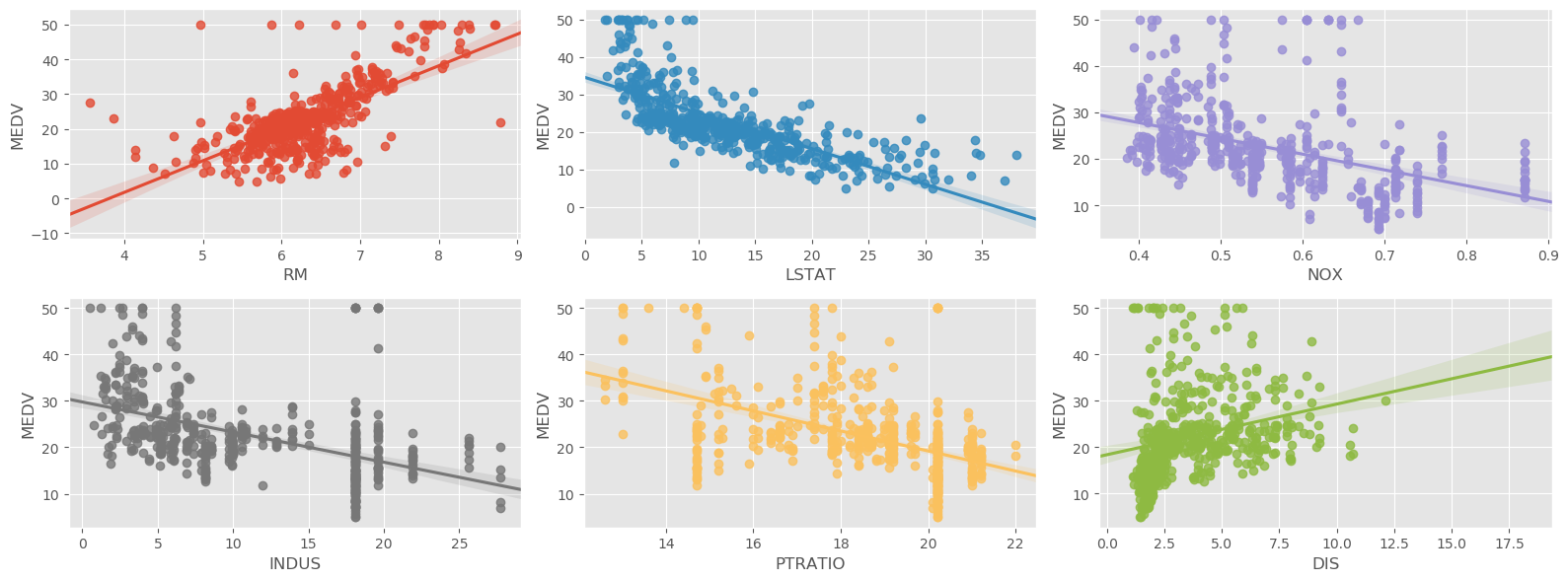
In EDA, we routinely use linear regression on scatterplots. Here is an example of putting them together:
Example 2
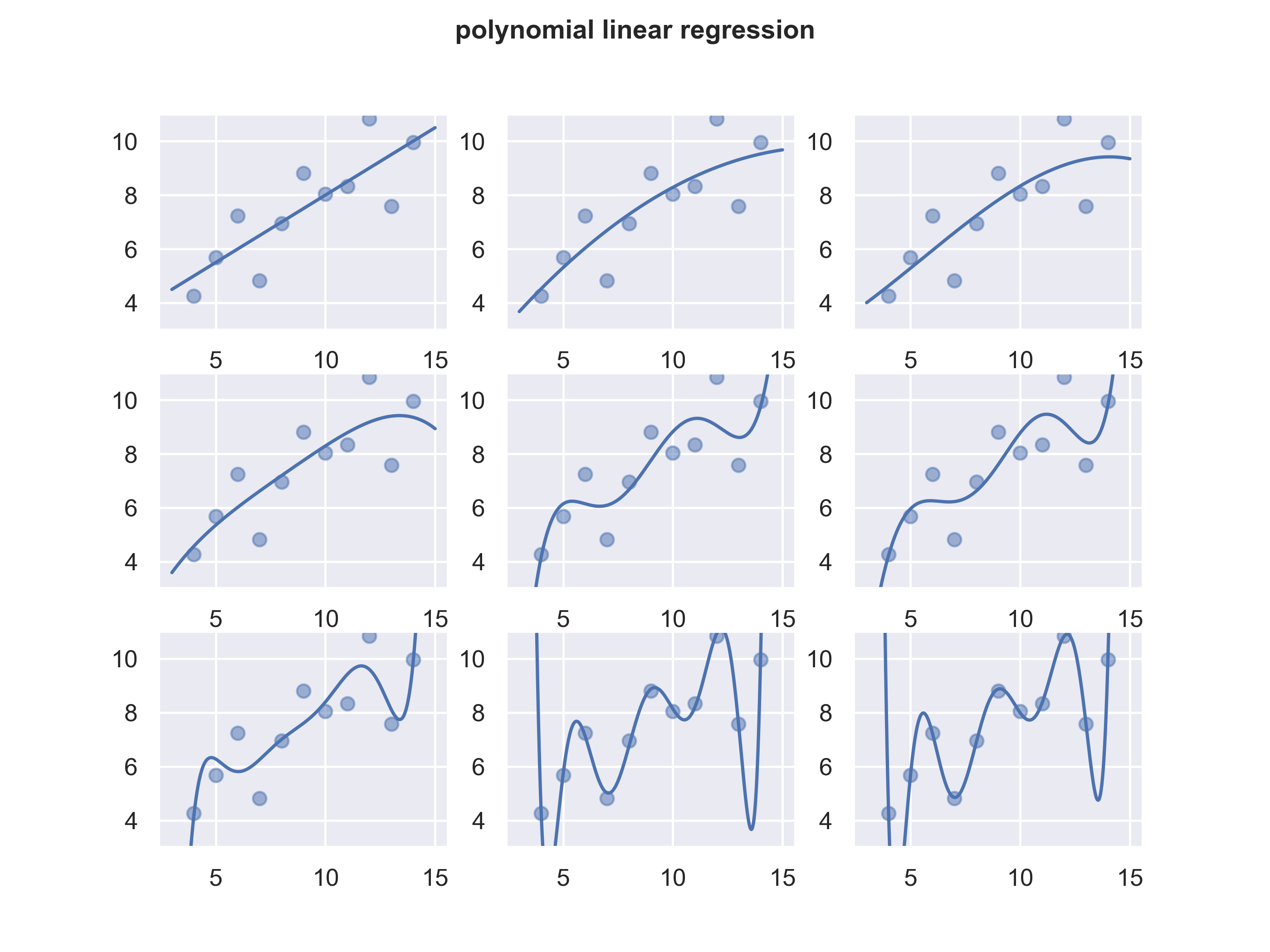
In feature selection, we look at various transformation of a feature:
title = 'polynomial linear regression'
fig, axs = plt.subplots(3,3,sharex='col', sharey='row')
sns.regplot(x=df.x,y=df.y,data=df,ax=axs[0,0],order=1, ci=None)
sns.regplot(x=df.x,y=df.y,data=df,ax=axs[0,1],order=2, ci=None)
sns.regplot(x=df.x,y=df.y,data=df,ax=axs[0,2],order=3, ci=None)
sns.regplot(x=df.x,y=df.y,data=df,ax=axs[1,0],order=4, ci=None)
sns.regplot(x=df.x,y=df.y,data=df,ax=axs[1,1],order=5, ci=None)
sns.regplot(x=df.x,y=df.y,data=df,ax=axs[1,2],order=6, ci=None)
sns.regplot(x=df.x,y=df.y,data=df,ax=axs[2,0],order=7, ci=None)
sns.regplot(x=df.x,y=df.y,data=df,ax=axs[2,1],order=8, ci=None)
sns.regplot(x=df.x,y=df.y,data=df,ax=axs[2,2],order=9, ci=None)
plt.ylim(3,11)
plt.close()
Example 3
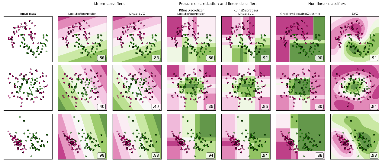
An example of using subplots in comparing models. Which Model is Superior? It all depends on the data. And gradient boosting is not always the best.
os.chdir('C:\\Users\\sache\\OneDrive\\Documents\\python_SAS\\Python-for-SAS-Users\\Volume2\\logistic regression')
import numpy as np
import matplotlib.pyplot as plt
from matplotlib.colors import ListedColormap
from sklearn.model_selection import train_test_split
from sklearn.preprocessing import StandardScaler
from sklearn.datasets import make_moons, make_circles, make_classification
from sklearn.linear_model import LogisticRegression
from sklearn.model_selection import GridSearchCV
from sklearn.pipeline import make_pipeline
from sklearn.preprocessing import KBinsDiscretizer
from sklearn.svm import SVC, LinearSVC
from sklearn.ensemble import GradientBoostingClassifier
from sklearn.utils._testing import ignore_warnings
from sklearn.exceptions import ConvergenceWarning

print(__doc__)

h = .02  # step size in the mesh
def get_name(estimator):
    name = estimator.__class__.__name__
    if name == 'Pipeline':
        name = [get_name(est[1]) for est in estimator.steps]
        name = ' + '.join(name)
    return name

# list of (estimator, param_grid), where param_grid is used in GridSearchCV
classifiers = [
    (LogisticRegression(random_state=0), {
        'C': np.logspace(-2, 7, 10)
    }),
    (LinearSVC(random_state=0), {
        'C': np.logspace(-2, 7, 10)
    }),
    (make_pipeline(
        KBinsDiscretizer(encode='onehot'),
        LogisticRegression(random_state=0)), {
            'kbinsdiscretizer__n_bins': np.arange(2, 10),
            'logisticregression__C': np.logspace(-2, 7, 10),
        }),
    (make_pipeline(
        KBinsDiscretizer(encode='onehot'), LinearSVC(random_state=0)), {
            'kbinsdiscretizer__n_bins': np.arange(2, 10),
            'linearsvc__C': np.logspace(-2, 7, 10),
        }),
    (GradientBoostingClassifier(n_estimators=50, random_state=0), {
        'learning_rate': np.logspace(-4, 0, 10)
    }),
    (SVC(random_state=0), {
        'C': np.logspace(-2, 7, 10)
    }),
]

names = [get_name(e) for e, g in classifiers]

n_samples = 100
datasets = [
    make_moons(n_samples=n_samples, noise=0.2, random_state=0),
    make_circles(n_samples=n_samples, noise=0.2, factor=0.5, random_state=1),
    make_classification(n_samples=n_samples, n_features=2, n_redundant=0,
                        n_informative=2, random_state=2,
                        n_clusters_per_class=1)
]

fig, axes = plt.subplots(nrows=len(datasets), ncols=len(classifiers) + 1,
                         figsize=(21, 9))

cm = plt.cm.PiYG
cm_bright = ListedColormap(['#b30065', '#178000'])

# iterate over datasets
for ds_cnt, (X, y) in enumerate(datasets):
    print('\ndataset %d\n---------' % ds_cnt)

    # preprocess dataset, split into training and test part
    X = StandardScaler().fit_transform(X)
    X_train, X_test, y_train, y_test = train_test_split(
        X, y, test_size=.5, random_state=42)

    # create the grid for background colors
    x_min, x_max = X[:, 0].min() - .5, X[:, 0].max() + .5
    y_min, y_max = X[:, 1].min() - .5, X[:, 1].max() + .5
    xx, yy = np.meshgrid(
        np.arange(x_min, x_max, h), np.arange(y_min, y_max, h))

    # plot the dataset first
    ax = axes[ds_cnt, 0]
    if ds_cnt == 0:
        ax.set_title("Input data")
    # plot the training points
    ax.scatter(X_train[:, 0], X_train[:, 1], c=y_train, cmap=cm_bright,
               edgecolors='k')
    # and testing points
    ax.scatter(X_test[:, 0], X_test[:, 1], c=y_test, cmap=cm_bright, alpha=0.6,
               edgecolors='k')
    ax.set_xlim(xx.min(), xx.max())
    ax.set_ylim(yy.min(), yy.max())
    ax.set_xticks(())
    ax.set_yticks(())

    # iterate over classifiers
    for est_idx, (name, (estimator, param_grid)) in \
            enumerate(zip(names, classifiers)):
        ax = axes[ds_cnt, est_idx + 1]

        clf = GridSearchCV(estimator=estimator, param_grid=param_grid)
        with ignore_warnings(category=ConvergenceWarning):
            clf.fit(X_train, y_train)
        score = clf.score(X_test, y_test)
        print('%s: %.2f' % (name, score))

        # plot the decision boundary. For that, we will assign a color to each
        # point in the mesh [x_min, x_max]*[y_min, y_max].
        if hasattr(clf, "decision_function"):
            Z = clf.decision_function(np.c_[xx.ravel(), yy.ravel()])
        else:
            Z = clf.predict_proba(np.c_[xx.ravel(), yy.ravel()])[:, 1]

        # put the result into a color plot
        Z = Z.reshape(xx.shape)
        ax.contourf(xx, yy, Z, cmap=cm, alpha=.8)

        # plot the training points
        ax.scatter(X_train[:, 0], X_train[:, 1], c=y_train, cmap=cm_bright,
                   edgecolors='k')
        # and testing points
        ax.scatter(X_test[:, 0], X_test[:, 1], c=y_test, cmap=cm_bright,
                   edgecolors='k', alpha=0.6)
        ax.set_xlim(xx.min(), xx.max())
        ax.set_ylim(yy.min(), yy.max())
        ax.set_xticks(())
        ax.set_yticks(())

        if ds_cnt == 0:
            ax.set_title(name.replace(' + ', '\n'))
        ax.text(0.95, 0.06, ('%.2f' % score).lstrip('0'), size=15,
                bbox=dict(boxstyle='round', alpha=0.8, facecolor='white'),
                transform=ax.transAxes, horizontalalignment='right')
plt.tight_layout()
# Add suptitles above the figure
plt.subplots_adjust(top=0.90)
suptitles = [
    'Linear classifiers',
    'Feature discretization and linear classifiers',
    'Non-linear classifiers',
]
for i, suptitle in zip([1, 3, 5], suptitles):
    ax = axes[0, i]
    ax.text(1.05, 1.25, suptitle, transform=ax.transAxes,
            horizontalalignment='center', size='x-large')
save_fig("plot_discretization_classification", tight_layout=False)
plt.show()
I don’t mean to side track. But it is important to note since it is related to the plots below.
GBM is a tree-based model. Decision trees are best for boxy type of data that you can cut up in boxes. As shown in plot below, gradient boosting is not as good for the linearly separable data on the third row (bottom left).
- Decision tree (not in plot) has hierarchical boxes
- Gradient boosting has boxes but not hierarchical. They are long + short
Feature discretization (making continuous variables discrete) is to make continuous variables boxier, which makes regression models more like trees.
Learn to recognize data type and algorithm decision boundary. This will help deciding which model to use based on data type.