Compare Stocks in Two Sectors
We often need to compare stock performances within and across sectors. In the following example, we plot six major stocks from technology and energy sectors. The top ones are the energy stocks, representing Exxon, BP and Chevron. The bottom panel contains the technology stocks, representing Apple, Amazon and Google.
 tickers = ["XOM","BP", "CVX","AAPL","AMZN","GOOG"]
 stocks = [pdr.get_data_yahoo(i, start=start, end=date.today())['Adj Close'].rename(i) for i in tickers]
 stocks_df = pd.DataFrame(stocks).T
 tickers= np.array(tickers).reshape(2,3)
 fig, ax = plt.subplots(2,3, figsize=(12,6))
 for i in range(2):
     for j in range(3):
         stocks_df[tickers[i,j]].plot(ax=ax[i, j],color="skyblue").set_title(tickers[i,j])
Although the energy stocks have much more turbulences in the last twenty years, figure shows they are all great performers over their lifespan. They are all winners.
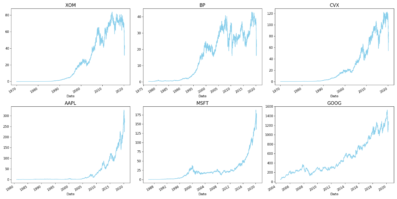
However, if we look at the stocks from 2004, the year when Google had its IPO, we get a different picture. The technology stocks have much higher growth than the mature energy stocks. That’s why mutual funds consist of mostly technology stocks are called “growth stocks” whereas mature stocks are called “value stocks”.
Although we expect Chevron stocks are highly correlated with Exxon, it may come as a surprise that Chevron is also highly correlated with Apple and Google stock prices. The three energy stocks are less correlated with one another than the three technology stocks. The correlation between the latter is above 0.94, which is remarkably high.
 print( stocks_df.dropna(axis=0,how='any').corr())
Out:
       XOM    BP   CVX  AAPL  MSFT  GOOG
XOM  1.000 0.265 0.891 0.607 0.439 0.654
BP   0.265 1.000 0.343 0.344 0.458 0.426
CVX  0.891 0.343 1.000 0.849 0.735 0.862
AAPL 0.607 0.344 0.849 1.000 0.951 0.966
MSFT 0.439 0.458 0.735 0.951 1.000 0.943
GOOG 0.654 0.426 0.862 0.966 0.943 1.00
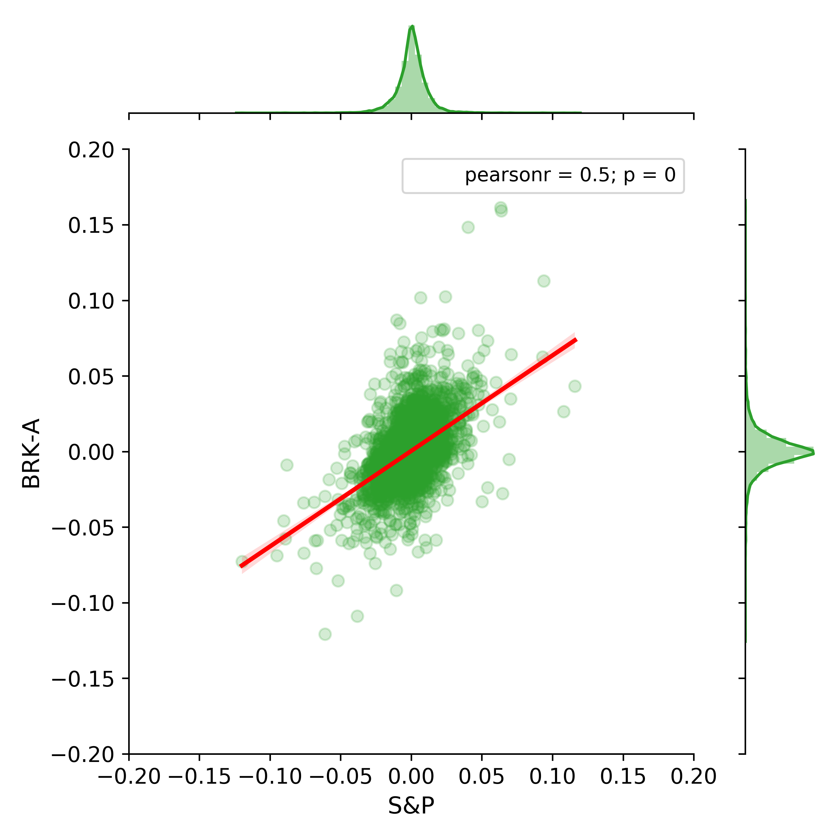
Comparing stock and market returns
We could download daily price data from Yahoo! Finance for one stock and the market represented by S&P 500. Then estimate their returns and represent them via a graph using the following code. Please note that we have used the same timespan from 1990. Using the same time span is necessary if we are comparing them for the same time periods.
 def stock_return(ticker):
     daily_return = pdr.get_data_yahoo(ticker, start=start, end=end)['Adj Close'].pct_change().rename(ticker)
     return daily_return
 retSP500 = stock_return('^GSPC')
 ret = stock_return('BRK-A')
 ret_df = pd.merge(ret,retSP500,how='inner', left_index=True,right_index=True)

 from scipy import stats
 title ="S&P 500 and Berkshire Stock Returns"
 joint_kws = {'scatter_kws':dict(alpha=0.2),'line_kws':dict(color='r')}
 g=sns.jointplot(x='BRK-A', y="S&P", data= ret_df .loc['1990':], kind='reg',color=green, joint_kws=joint_kws, xlim=[-.2,.2],ylim=[-.2,.2])
 g.annotate(stats.pearsonr)
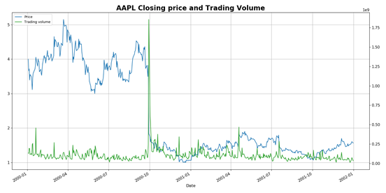
Price and Volume
Theoretically price is independent of volume, but only by risk, as indicated by many efficient market hypotheses (ex. CAPM). However, these two are closely related in the real market. If the correlation was strongly negative, it is indicating selloff, which is often the case in risky bear markets.
 def plot_price_volume(ticker, ticker_df):
     ax1 = ticker_df.Close.plot(color=blue, grid=True, label='Price')
     ax2 = ticker_df.Volume.plot(color=green,grid=True, secondary_y=True, label='Trading volume')
     h1, l1 = ax1.get_legend_handles_labels()
     h2, l2 = ax2.get_legend_handles_labels()
     plt.title("%s Closing price and Trading Volume"%ticker, fontdict={'fontsize': 20, 'fontweight': 'bold'})
     plt.legend(h1+h2, l1+l2, loc=2)
     plt.show()
 plot_price_volume('AAPL', AAPL)
This price and volume relationship seem to persist overtime for some companies. Take the example of Royal Dutch Shell as an example.
 RDSA = pdr.get_data_yahoo('RDS-A', start=datetime(2005,1,1), end=date.today())
 RDSA['qtr'] =RDSA.index.quarter
 RDSA['year'] = RDSA.index.year
 RDSA['QoQ'] =RDSA.Close.pct_change()
 RDSA= RDSA.loc['2010':,['Close','Volume' ,'year','qtr']]
 palette = sns.cubehelix_palette(18, start=2, rot=0, dark=0, light = 0.95, reverse = False)
 sns.pairplot(RDSA,palette=palette, hue='year' )
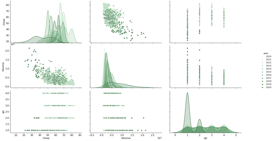
The relationship for this particular company is strong enough to show a R square of -0.49.
 from scipy import stats as scs
 slope, intercept, r_value, p_value, std_err =scs.linregress(RDSA.Close,RDSA.Volume)
 print("Slope: {0:.1}".format(slope))
 print("R square: {0:.3}".format(r_value))
Out:
Slope: -1e+05
R square: -0.489
Interesting enough, the similar pattern is observed for the top performing stock Neflix, although the effect is much smaller.
 netflix = pdr.get_data_yahoo("NFLX",start=start,end=end)
 plot_price_volume("NFLX", netflix)
 slope, intercept, r_value, p_value, std_err =scs.linregress(netflix.loc['2010':].Close,netflix.loc['2010':].Volume)
 print("Slope: {0:.1}".format(slope))
 print("R square: {0:.3}".format(r_value))
Out:
Slope: -8e+04
R square: -0.428
Candlestick plot
The mplfinace library, replacing mpl-finance by mid-2020, extents matplotlib utilities for the visualization, and visual analysis, of financial data.
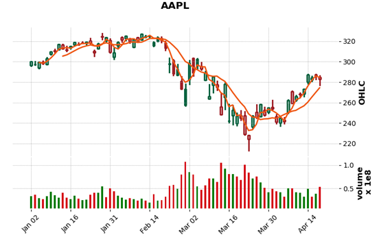
A frequently used plot in trading is the candlestick plot, where a candlestick represents price movement of time period. Using the mplfinace library, we can easily plot candlestick plots with pre-defined styles and flexibility. It includes price moving averages overlaying candlestick plot in the top panel, and trading volume in the bottom panel.
Example below shows candlestick plot with 3-day and 9-day moving average overlay. When the close price is higher than the opening price, the candlestick is green, conversely it is red. In Figure 1- 13, Apple stock price went through a sell out since mid-Feb 2020 due to the coronavirus pandemic in the US, and worldwide. On March 23, the price dropped to about $212, more than $100 less than about a month ago. Large trading volume indicates selloff proceeding the price fall.
 import matplotlib.pyplot as plt
 import mplfinance as mpf
 import datetime
 start = datetime.datetime(2000, 1, 1)
 end=datetime.date.today() # today is 04-18-2020
 import pandas_datareader.data as pdr
 AAPL = pdr.get_data_yahoo('AAPL', start=start, end=end)
 daily = AAPL.loc['2020':]
 mpf.plot(daily, type='candle', style='charles',title='AAPL',
          ylabel='OHLC',
          ylabel_lower='volume',volume=True, mav=(3,9),savefig='AAPL_2020.png')