
When we want to know relationships between two things, by “things” we mean numerical variables, Pearson, Spearman, Kendall are commonly used correlation measures.
Gini, and Gini variations also the relationship between 2 things.
The \(\xi\) correlation is a candidate for detecting whether one thing is a function of the other, i.e. whether one is dependent on the other. Because it does not assume linearity,it can detect non-monotonic functional relationships when other correlation measures fail, such as a sine or cosine.
The \(\xi\) correlation is actually very simple. In my view, is a variation of the Gini score, where one thing is used for ranking and the other thing is used for sorting.
The \(\xi\) correlation (xicor) is a robust association measure that does not presuppose linearity. It is based on cross correlation between ranked increments.
Algorithm
- Take \(X\) and \(Y\) as n-vectors of observations
- Compute the ranks \(r_i\) of the \(Y\) observations
- Sort the data tuples \((x_1,y_1,r_1), ..., (x_n,y_n,r_n)\) by \(X\) so that \(x_1 \le x_2 \le x_n\).
- Ties are broken at random (not shown in formula).
This formula is very simple, but requires some explanation that are not so simple to see: Multiply by 3: this is to normalize the expected value of the difference between 2 random variables from the standard uniform distribution, which is 1/3.
Divide by \(n^2-1\): this should be factored into \(n -1\) and \(n + 1\).
- divide by \(n -1\): this is to take the average. We have \(n -1\) pairs of differences of adjacent rows of \(r_{i+1}-r_i\).
- divide by \(n + 1\): this is to normalize differences of adjacent rows of \(r_{i+1}-r_i\), which can be large. The maximum difference is \(n -1\). \(n + 1\) is likely because of avoiding the situation of \(1 -1\), when \(n\) is one.
XICOR in Python
def corrs(x,y, title):
    """
    input: 2 numpy arrays
    computes pearson, spearman,kendall, and xicor correlations
    implements the xicor correlation
    plot a scatterplot between x and y, and plot a barplot comparing the correlations
    returns a pandas series with the scores and function used between y and x
    """
    d = pd.DataFrame({'x':x,'y':y})
    d['y_rank'] = d.y.rank()
    d.sort_values(by='x',inplace=True)
    pearson = d[['x','y']].corr().iloc[1,0]
    spearman = d[['x','y']].corr(method='spearman').iloc[1,0]
    kendall = d[['x','y']].corr(method='kendall').iloc[1,0]
    xicor = 1-3*np.sum(np.abs(d.y_rank.diff()))/(d.shape[0]**2-1) #xicorr
    corrs = pd.Series([pearson,spearman,kendall,xicor], index=corr_lt)
    fig, ax = plt.subplots(1,2, figsize=(8,4))
    d[['x','y']].plot.scatter(x='x',y='y', ax=ax[0])
    corrs.plot(kind='bar',rot=0, ax=ax[1])
    for p in ax[1].patches:
        ax[1].annotate("{:.2f}".format(p.get_height()), (p.get_x()*1.005, p.get_height()*1.005))
    plt.suptitle(title)
    save_fig(title)
    plt.show()
    corrs['function'] = title
    return corrs
Out:
Saving figure Positive Slope
Saving figure Negative Slope
The following illustrates the comparisons of 4 correlations amongst various functions, where x is uniformly distributed random variables from 0 to 1.
np.random.seed(1234) # use seed for replicable

N=100 #small number for faster run
corr_lt = ['pearson','spearman','kendall','xicor']
x=2*np.random.uniform(size=N)-1
noise = np.random.normal(0,0.1,N)

y=x+noise
title="Positive Slope"
corrs0= corrs(x,y,title)

# x=2*np.random.uniform(size=N)-1
y=1- x+noise
title="Negative Slope"
corrs1 = corrs(x,y,title)

title="Quadratic Parabola"
# x=2*np.random.uniform(size=N)-1
y=x**2+noise
corrs2 = corrs(x,y,title)
# print("{:.2f}".format(3.1415926));

title="Sine"
# x=2*np.random.uniform(size=N)-1
y=np.sin(x*np.pi*2)+noise
corrs3 = corrs(x,y,title)

title="Cosine"
# x=2*np.random.uniform(size=N)-1
y=np.cos(x*np.pi*2)+noise
corrs4 = corrs(x,y,title)

title="Exponential"
# x=2*np.random.uniform(size=N)-1
y=np.exp(5*x)+noise
corrs5 = corrs(x,y,title)

title="Cubic Parabola"
# x=2*np.random.uniform(size=N)-1
y=x**3 +noise
corrs6 = corrs(x,y,title)

title="Cubic Root"
# x=2*np.random.uniform(size=N)-1
y=x**(1/3) +np.random.normal(0,0.1,N)
corrs7 = corrs(x,y,title)

title="Noise"
# x=2*np.random.uniform(size=N)-1
y=np.random.normal(0,0.1,N)
corrs8 = corrs(x,y,title)

Out:
Saving figure Quadratic Parabola
Saving figure Sine
Saving figure Cosine
Saving figure Exponential
Saving figure Cubic Parabola
C:\ProgramData\Anaconda3\Scripts\ipython:69: RuntimeWarning: invalid value encountered in power
Saving figure Cubic Root
Saving figure Noise


After collecting all the results together, the maximum correlation for each function is identified using .abs().idxmax(axis=1).
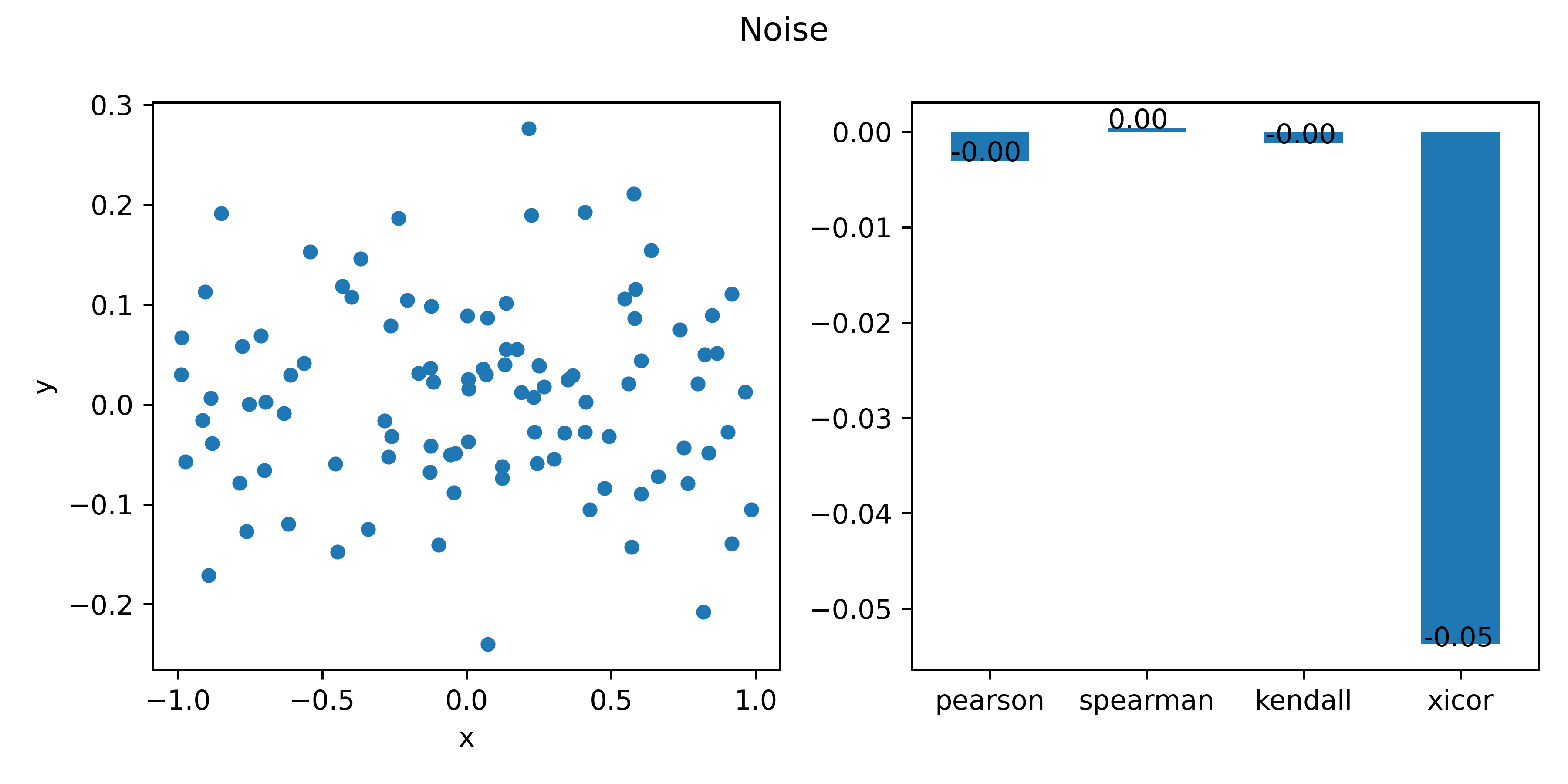
The Xi correlation is best at the quadratic parabola, sine, cosine,which makes sense.
Unfortunately, it is also very good at picking up noises.
summary = pd.concat([corrs1, corrs2, corrs3, corrs4, corrs5, corrs6,corrs7, corrs8], axis=1).T
summary.__dict__.update(summary.astype({'pearson':np.float32,'spearman': np.float32, 'kendall': np.float32,'xicor':np.float32}).__dict__)
summary['max'] = summary.iloc[:,:-1].abs().idxmax(axis=1)
# pearson spearman kendall xicor function max
# 0 0.984 0.984 0.897 0.819 Positive Slope pearson
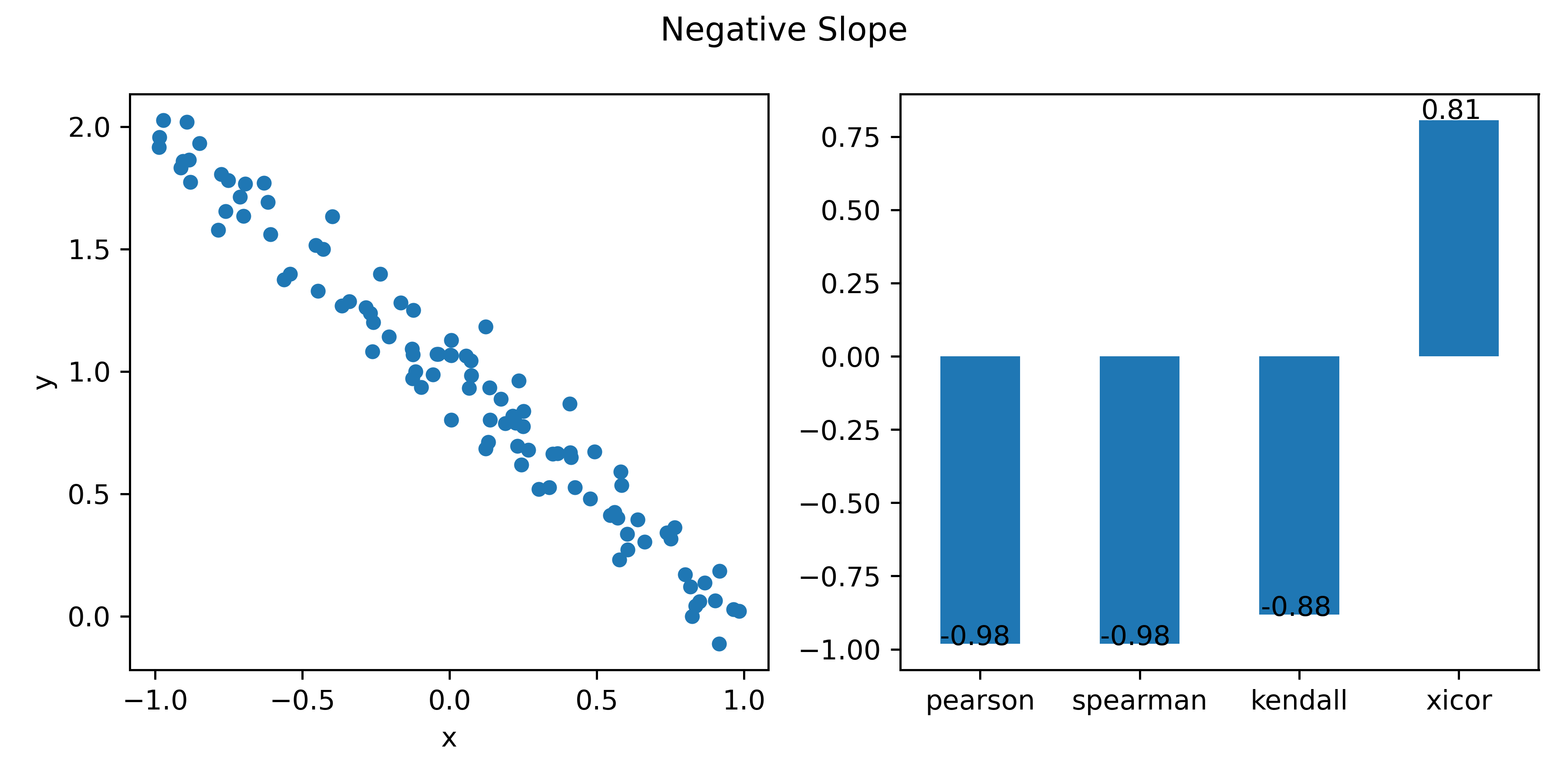
# 1 -0.986 -0.983 -0.893 0.815 Negative Slope pearson
# 2 -0.096 0.024 0.055 0.612 Quadratic Parabola xicor
# 3 -0.358 -0.293 -0.178 0.795 Sine xicor
# 4 -0.113 -0.153 -0.108 0.781 Cosine xicor
# 5 0.675 0.982 0.923 0.882 Exponential spearman
# 6 0.892 0.875 0.724 0.613 Cubic Parabola pearson
# 7 0.884 0.918 0.762 0.892 Cubic Root spearman
# 8 -0.003 0.000 -0.001 -0.054 Noise xicor
XICOR in R
This set of code is not a direct translation of the Python code. It does the same thing, achieve the same goals, but is written very differently.
if (!require('XICOR')){install.packages('XICOR');require('XICOR')}

## Examples
xicor<- function(x,y)
{
    d=data.frame(x,y)
    d$r=rank(d$y)
    d=d[order(d$x),]
    1-3*sum(abs(diff(d$r)))/(nrow(d)^2-1)
}
n=100
x=2*runif(n)-1
# positive slope
y=x+rnorm(n,0,0.1)
Correlation = c(method="pearson","spearman",'chatterjee','xicor')
Value =c( cor(x,y,method='pearson')
        , cor(x,y,method='spearman')
        , xicor(x,y) # implemented above
        , XICOR::calculateXI(x,y)
        )
bars=data.frame(Correlation, Value)
par(mfrow=c(1,2))
plot(x,y,pch=16, main="positive slope")
barplot(Value,names.arg=Correlation,ylim=c(-1,1),las=2)

# ushape
y=4*(x^2) = rnorm(n,0,0.1)
Value = c(cor(x,y),cor(x,y, method='spearman'),xicor(x,y),calculateXI(x,y))
bars=data.frame(Correlation,value)
par(mfrow=c(1,1))
plot(x,y,pch=16,main="quadratic parabola")
barplot(Value,names.arg=Correlation, ylim=c(-1,1),las=2)
# sine
y=sin(2*3.14*x)+rnorm(n,0,0.1)
Value = c(cor(x,y),cor(x,y, method='spearman'),xicor(x,y),calculateXI(x,y))
bars=data.frame(Correlation,value)
par(mfrow=c(1,1))
plot(x,y,pch=16,main="Sine")
barplot(Value,names.arg=Correlation, ylim=c(-1,1),las=2)
# cos
y=cos(2*3.14*x)+rnorm(n,0,0.1)
Value = c(cor(x,y),cor(x,y, method='spearman'),xicor(x,y),calculateXI(x,y))
bars=data.frame(Correlation,value)
par(mfrow=c(1,1))
plot(x,y,pch=16,main="Cosine")
barplot(Value,names.arg=Correlation, ylim=c(-1,1),las=2)

# backwards
y= 1 - x+rnorm(n,0, 0.1)
Value = c(cor(x,y),cor(x,y, method='spearman'),xicor(x,y),calculateXI(x,y))
bars=data.frame(Correlation,value)
par(mfrow=c(1,1))
plot(x,y,pch=16,main="Negative Slope")
barplot(Value,names.arg=Correlation, ylim=c(-1,1),las=2)
# noise
y= rnorm(n,0,0.1)
Value = c(cor(x,y),cor(x,y, method='spearman'),xicor(x,y),calculateXI(x,y))
bars=data.frame(Correlation,value)
par(mfrow=c(1,1))
plot(x,y,pch=16,main="Negative Slope")
barplot(Value,names.arg=Correlation, ylim=c(-1,1),las=2)
# exp
y= exp(10*x) + rnorm(n,0,0.1)
Value = c(cor(x,y),cor(x,y, method='spearman'),xicor(x,y),calculateXI(x,y))
bars=data.frame(Correlation,value)
par(mfrow=c(1,1))
plot(x,y,pch=16,main="Exponent")
barplot(Value,names.arg=Correlation, ylim=c(-1,1),las=2)

# cube
y= x**3 + rnorm(n,0,0.1)
Value = c(cor(x,y),cor(x,y, method='spearman'),xicor(x,y),calculateXI(x,y))
bars=data.frame(Correlation,value)
par(mfrow=c(1,1))
plot(x,y,pch=16,main="Cubic")
barplot(Value,names.arg=Correlation, ylim=c(-1,1),las=2)
# rbrt
y= sign(x)*(abs(x)**(1/3)) + rnorm(n,0,0.1)
Value = c(cor(x,y),cor(x,y, method='spearman'),xicor(x,y),calculateXI(x,y))
bars=data.frame(Correlation,value)
par(mfrow=c(1,1))
plot(x,y,pch=16,main="Cubic Root")
barplot(Value,names.arg=Correlation, ylim=c(-1,1),las=2)
Expected Value of Difference of uniformly distributed r.v.is \(1/3\)
We can verify algebraically using probability. We can also use Python to show the “expected” result. Here we take the visual rounte.
We not only show that the expected value of difference is \(1/3\), but also the expected value of sum is \(1\).
def sum_uniform(n):
    x=np.random.uniform(size = n)
    y=np.random.uniform(size = n)
    return sum(abs(x+y))/n
def diff_uniform(n):
    x=np.random.uniform(size = n)
    y=np.random.uniform(size = n)
    return sum(abs(x-y))/n

N = np.arange(1,1000)
s=[]
for i in N:
    s.append(sum_uniform(i))
d=[]
for i in N:
    d.append(diff_uniform(i))

fig, ax = plt.subplots(1,2,figsize=(8,4))
ax[0].plot(N, d,color=blue, alpha=0.5)
ax[0].hlines(1/3,1,999)
ax[0].set_title("difference of 2 uniformly distributed r.v.")
ax[1].plot(N, s,color=blue, alpha=0.5)
ax[1].hlines(1,1,999)
ax[0].set_ylim([-0.2,1.2])
ax[1].set_ylim([-0.2,1.2])
ax[0].set_title("difference of 2 uniformly distributed r.v.")
ax[1].set_title("sum of 2 uniformly distributed r.v.")
save_fig("sum and difference of 2 uniformly distributed")
plt.show()
