In my first job at Verisk Analytics, we used the Gini index as a metric for the GLM insurance models. In my later jobs in banking, I saw similar terms but they are used differently. This post first review the Lorenz curve amd the associated Gini index and then how it compares Gini index in the CAP (“cumulative accuaracy profile”), and the Gini index used along with ROC and AUC in binary target models such as probability of default (PD) models in banking.
The Gini index is model-agnostic. The Gini index takes on differenct forms in different context, varying by whether target is continuous or binary, sorting, and area definitions in formulas.
1. Gini index and the Lorenz curve
The Gini index is a number that summarizes what the Lorenz curve tries to capture. Lorenz was an Italian economist. His idea was to compare the two distributions, population and income, using the X and Y axis. These two are different subjects and have different scales. But their distributions (cumulative distributions, aka “CDF” or “quantiles”) are comparable.
The key in my opinion is in the sorting:
- each household only counts as 1, therefore, the order does not matter.
- but each household has different income.
- you can sort the households by income acendingly, or descendingly.
In the Lorenz curve, the households are sorted by income ascendingly.
Hence, the perfect inequality (the perfect non-random) line goes horizontally to the end, and then shoots straight up. What is means is that after we have accounted for almost all 100% of the population, we still have not gotten a penny of the income. All income are in the very last household.
Conversely, if each household posesses exactly 1/n of the income, then we have the perfect equality (the random line), which is the 45 degree diagonal line.
Real world situations are in between these two extremes.
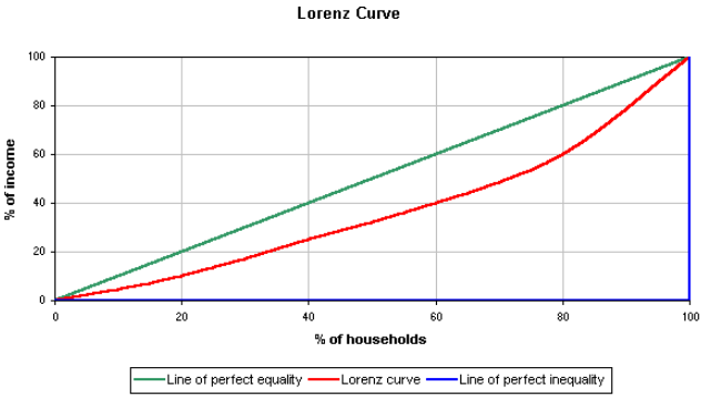
The Gini index is \(2*(the\:area\:between\:the\:curve\:and\:the\:diagnoal)\)
Sorting is relevant because households have different incomes.
2. How it is used in insurance modeling
In insurance GLM (can be any type of model) modeling of loss ratio, relativity or pure premium, the policy holders are sorted by their loss ratios or sorted by pure premium in ascending order. The more accurate model will have a more superior/accurate sort, and the curve will be more curvy/convex than a less accurate model.
The target variable is numeric/cardinal.
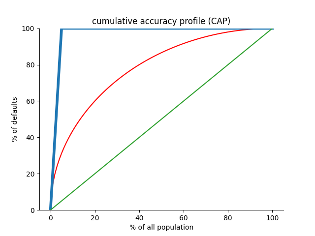
3. The CAP and the Gini coefficient The cumulative accuaracy profile (CAP) is very similar to the Lorenz curve: both are comparing two distributions.
There are three differences:
- The CAP is used for binary target variable whereas the Lorenz curve is used for continuous variables, such as income.
- The CAP has the X axis sorted descendingly, i.e., the model predicted positives (or defaults) come first, then those model-predicted negatives (non-defaults), whereas the Lorenz curve X is sorted ascendingly by income (or by loss severity).
- The perfect model in the CAP (binary target) does not shoot 90 degree up. The perfect model has to get all the positives (defaults). Therefore its line lands on the top exactly at the actual positive(default) rate.
In this context, the “Gini coefficient” is the area between the model and the diagnonal (the random model) and the area between the perfect model and the diagnonal.
\[\frac{area between the model and the diagnona}{area between the perfect model and the diagnonal}\]This Gini coefficient or index in the CAP context is a little different from the one in the Lorenz curve context. But these two are very similar.
x=np.arange(0,101)
y1=np.where(1/0.05*x>100, 100, 1/0.05*x)
plt.plot(x, (100**2-(x-100)**2)**0.5, color='r', label = "real model")
plt.plot(x,y1, color=blue, lw=4, label = "perfect model")
plt.plot(x,x,color=green, label = "random model")
plt.ylim([0,100])
sns.despine(left=False, bottom=False)
plt.ylabel("% of defaults or positive")
plt.xlabel("% of all population")
plt.title( "cumulative accuracy profile (CAP)")
plt.show()
4. Gini index, AUC and ROC in banking PD models
The was first used during World War II for the analysis of radar signals. The purpose was to increase the prediction of correctly detected enemy aircrafts from their radar signals. The curves are formulated such that they measured the ability of a radar receiver operator to make these important distinctions, which was called the “Receiver Operating Characteristic”.
The ROC and AUC are commonly used in evaluating PD models in banks. They are also widely used in the the machine learning community as summary statistic for model comparison.

Note that the ROC curve plots the true-positive rate against the false-positive rate as the cut-off threshold increases. If a model is perfect, then the smallest threshold would make the true-positive rate shoot up to 100%.

The AUC means area under the ROC curve. In this context, the Gini index has a very different meaning from the Lorenz curve or CAP. The Gini index is:
\[G = 2*(area\:between\:the\:ROC\:and\:the\:diagonal)\]Furthermore,
\[AUC - \frac{G}{2} = \frac{1}{2}\]And it is identical to the Sommer’s D metric, which measures how correlated two sets of ordinal (the actual vs. model predicted) are.
Sumnmary
We have reviewed the Lorenz curve, Gini index, CAP, ROC and AUC. What they have in common is they all compare one cumulative rate vs the other. Sometimes the goal is to gauge equality (Lorenz curve) whereas sometimes the goal is to be as discriminatory as possible (CAP, ROC).
The Gini index takes on differenct meaning in different context, from the original Lorenz curve, CAP and then to the classification model. The Gini index is model-agnostic. It can be used for any types of models. The meanings differ in the following:
- model target is continuous or binary
- sorting direction (the ROC curve has no sorting involved in terms of X-axis and the Y-axis;the CAP is sorted by modeled defaults first, descendingly, whereas the Lorenz curve sorts the population ascendingly by their income or loss dollar,or loss severity)
- area definitions